
Bandz N’ Showz
Streamling the Show
Promotion Process
Musicians and Promoters Have Trouble Driving Fan Turnout to Shows...
When trying to log tour dates users (musicians, managers, etc…) have trouble keeping track of all the sites they need to post tour dates to and often have to redundantly
re-post information on many sites. We would like to explore ways to streamline the process by saving users time and frustration by developing a new platform.
This Section //
Design
What we tackled:
-
Moodboard
-
Style Guide
-
Gestalt Principles
-
High Fidelity Mocks
-
Building Our Prototype
1. Moodboard // Design
Setting The Tone

We also used Milanote to create a more comprehensive space to brainstorm our moodboard:
2. Style Guide // Design
Our Style Guide
Here are some top-level design choices we are using to convey our brand vibe throughout our community. We are also leveraging much inspiration from the Material Design Kit. Google Rocks!
You can find the full style guide here:


3. Gestalt Principles // Design
Material
Design Meets
Bandz N' Showz
1. Material Design is overall a pretty-loose set of principles that can be applied at a high level BUT basically the goal is to keep things looking sharp, consistent, clean and responsive from one platform to another.
2. Here is a resource you can use to dive in deeper into Material Design: https://material.io/
3. We also found some components we may use moving forward: https://gallery.io/apps and https://materialdesignkit.com/android-gui/

Our Homepage meets
Google Material Design


1. Moved our important content
up to be above the fold.
2. Added scrolling animation of
user testimonials that will
rotate left to right.
3. Content broken up top to
bottom into containers which
will rollout better on mobile.
Other Modifications / Off Script
Overall added greater explanation to what the product is and highlighted our partnerships. So people checking out the site for the first time understand what we are offering right off the bat :)
Next Steps
Potential to adjust layout once we roll out for mobile down the road for seamless responsive design
Our Homepage meets
Google Material Design
1. Moved our important content
up to be above the fold.
2. Added scrolling animation of
user testimonials that will
rotate left to right.
3. Content broken up top to
bottom into containers which
will rollout better on mobile.
Other Modifications / Off Script
Overall added greater explanation to what the product is and highlighted our partnerships. So people checking out the site for the first time understand what we are offering right off the bat :)
Next Steps
Potential to adjust layout once we roll out for mobile down the road for seamless responsive design
Our Dashboard meets
Google Material Design


1. Moved our show list up to be the first thing a user sees and is above the fold.
2. Better overall use of bold colors to separate out sections.
3. Added in a side navigation specific to users logged into dashboard.
4. Increased white space
and overall breathing room.
Other Modifications / Off Script
Stats are a bit more visual and less to the grid we want these to be a bit more arty.
Next Steps
May use Material Design list component during development. What other assets can we use while in dev?
4. High Fidelity Mocks // Design
Form to Function Blending in Design
Improvements with Style


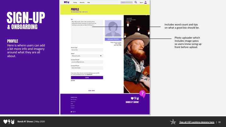


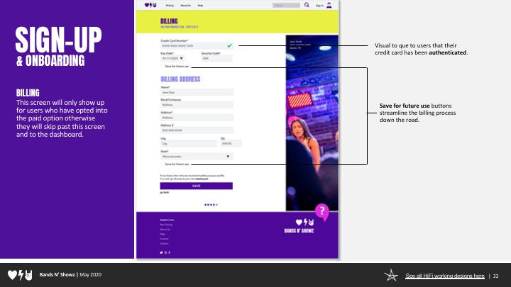

Using our testing insight from our gurilla testing here are some before and image of how we applied our tester feedback into our high fidelity mocks up in the next round.
5. Build Our Prototype // Design
Building Our Working Prototype
Once we had our high fidelity designs created we used InVision to create a high fidelity working prototype for our users to test. Feel free to scroll though the screen below to get a feel for our design.
Full-screen working prototype: Bandz N Showz Figma File